For over 10 years I’ve been shaping brands through logos, packaging, apparel, and media. Alongside professional work, my design platform Rollers’ Studio has been a long-running outlet to experiment and evolve my approach to branding.
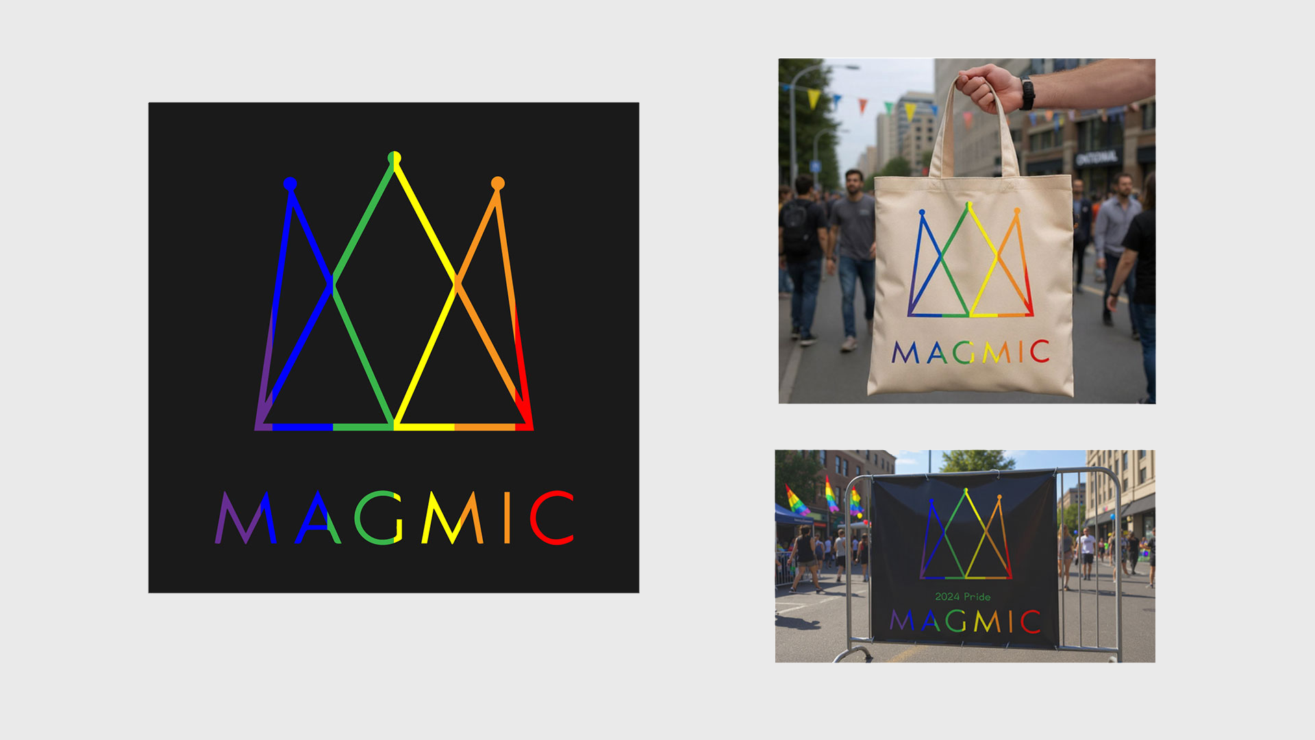
Pride design created for Magmic's 2024 Pride month campaign in Ontario: A quick “just make the logo rainbow” brief? Not quite. For Ottawa Pride, I reimagined Magmic’s crown mark as a vibrant festival identity — from digital to the streets. The rainbow geometry carried onto eco-friendly totes (because visibility and sustainability win hearts) and even the barricades right outside Magmic’s office, where thousands passed through. A simple tweak turned into a bold, joyful brand moment rooted in local pride and presence.
Custom Logo Designs Tailored to Unique Brand Stories: Logos don’t have to whisper corporate — they can tell stories. These designs fuse illustration with branding principles to create marks full of personality and purpose. Not polished monotone stamps, but character-driven visuals built to stand out.
Endeavor Snowboard design, artist series concept: For Endeavor’s 2014 Artist Series, I translated my signature speaker motif into snowboard and tee designs, expanding it into cropped circular patterns inspired by ’80s Japanese graphics. Black and gold paired with chunky Japanese typography created a bold, cohesive visual identity, blending my personal style with Endeavor’s brand and turning each piece into a statement of design-forward creativity.
Event Identity Designs Using Personal Illustration Work: These event campaigns highlight how illustration can elevate brand storytelling when fused with strong identity design. By treating each flyer or poster as both a visual artwork and a branded asset, I created materials that not only captured attention but also strengthened audience engagement. The balance of custom illustration, precise typography, and consistent visual hierarchy ensured the events were communicated with clarity and impact.
Rollers' Studio branded garment design ©: Rollers’ Studio goes from screen to street. I brought the brand to life on two-tone baseball caps and letterman jackets, carefully balancing logo placement, color, and graphic hierarchy to create a wearable extension of our identity. This layout shows how strategic branding transforms merchandise into a cohesive, design-forward experience that’s unmistakably Rollers’ Studio.


